
I made these two accessibility buttons, do you think I'm doing it right? https://pxhc.yorniq.xyz/just-test-dont-visit-me-i-am-broken (I put more info on that post of mine you had commented)
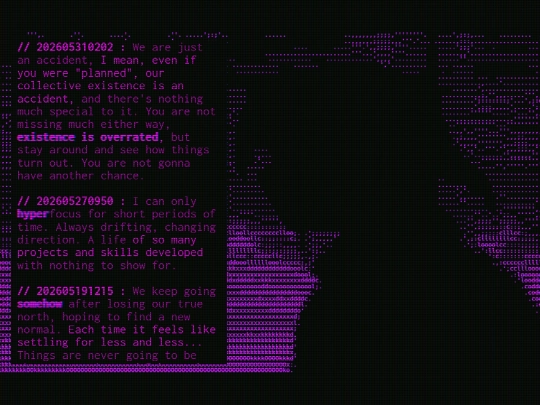
I'm thinking of making a button for accessibility... perhaps my site sucks for the colorblind? (can anyone tell me?), also a font change for dyslexia... I'm testing a full rewrite using correct semantic elements but I still don't know how screenreaders see it, and couldn't figure out how to make css buttons selectable just through keyboard though
8 likes
 pxhc
3 months ago
pxhc
3 months ago
I don't think this creepy disposable microblog is important though, I'm using it to learn how to do stuff better in whatever project I work in the future.
3 likes
pxhc
3 months ago
I just learned alt="" is not just a fallback if an image doesn't load, but a main accessibility tool
2 likes
 aznet
3 months ago
aznet
3 months ago
As someone who studied this awhile with limited text: The font is fine. The purple on purple is bad. four uniquecolors is all you need to ensure no two ever touch. themes are a big win for vibes either way.
2 likes
aznet
3 months ago
IMO: Add a second contrast color to each current theme to replace the background color. Then add a highlight color opposite of each for headers.
2 likes
aznet
3 months ago
(don't look at my site for examples of accessible design. I intentionally designed my index to be invisible to colorblind people xD) sry for spam. neocities limits sux.
1 like
pxhc
3 months ago
I've read about the font and on studies arial seems to preferable over those specialized fonts, I will think of a button just to change to it and increase lineheight. For contrast, do you think just decreasing brightness would suffice? I can add a hue rotate to the button too
pxhc
3 months ago
I was reading how screenreaders work, and my inputs were hidden so because of that they would treat my labels as plaintext, so I made the inputs visible and positioned outside of the screen, and I put aria-hidden on all purely visual stuff (the ascii art and the input/labels for colors and hidden ascii art, also the error message if chatbox doesn't load and some other stuff)
pxhc
3 months ago
and aria-label for a bunch of stuff as well, so a screenreader seeing // 202604061708 : won't read "slash slash two zero two six..." just "April 6, 2026 at 17:08", and also description for the inputs that actually matter... again, I don't even expect a blind person to find this site, I'm just using to learn how to make a site accessible
aznet
3 months ago
A lot of these changes are on the html side, which I can't help with: I am speaking only to supporting disabilities, not the code itself. Brightness alone isn't sufficient for enhancing contrast, you also need hue shift. No demand on any changes ofc, just offering tips as a dyslexic who is friends with colorblind ppl :)
1 like
13 likes

6 likes
terribly afraid of someone visiting my site right in the few minutes between me noticing the last update fucked up the template and me fixing it
16 likes

3 likes
4 likes
 p7uen
4 months ago
p7uen
4 months ago
Hi I visited the site earlier and the template was all fucked up for a few minutes, I'd like to make a complaint.
1 like
do you know of an online html editor that when picking color it opens a color wheel to choose from and you see it live? picking a color on a tab, copying the code, pasting in the other tab, opening another tab to compare with another color... it's quite boring...
4 likes
 nexx2654
4 months ago
nexx2654
4 months ago
like this? https://www.w3schools.com/colors/colors_picker.asp unless you need an actual code editor bc vscode has an online version you can use
1 like
aznet
4 months ago
Obsidian if you host a web front end. VSCode has a web version with local plugin support that can do this. I'll consider adding it as a feature to helba.yorniq.xyz/dex for you when I have the time.
1 like


![xX [ TR/BZ ] Xx avatar](/site_screenshots/41/77/toribytez/index.html.50x50.webp)


![[tofokyo.com] avatar](/site_screenshots/18/56/tofokyo/index.html.50x50.webp)


![[N6] avatar](/site_screenshots/22/24/blankbarrel/index.html.50x50.webp)


Ideally things should have labels also. The buttons work well but I'd default them to on if you do not label them. IMO it looks better with it on. The font change is a nice touch, it works well.